How to Choose Paint Colors for Any Room
How to choose paint colors for any room: read the light, start from fixed items, learn undertones, test big samples and suit the mood to how you use it.
4 min
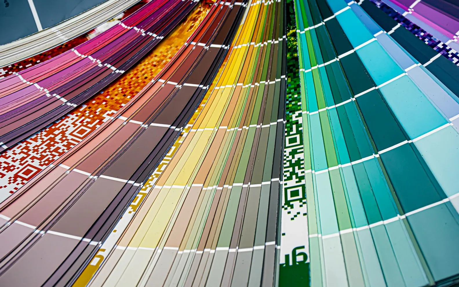
Standing in front of a wall of colour cards is a strangely stressful experience. Hundreds of shades, many with names that tell you nothing, and a nagging fear that the colour you love in the shop will look completely different at home. That fear is reasonable: it often will. The trick is not to find the perfect colour on a chart but to learn how your room will change it, then choose with that in mind.
The approach below works for living rooms, bedrooms, kitchens and hallways alike. It does not depend on trends, and it does not require a designer's eye, just a little patience and a few sample pots.
Begin with the things that are staying
Look around the room and list the things you are keeping: flooring, kitchen worktops, a large sofa, wooden furniture, tiles, curtains. These fixed elements have their own colours and undertones, and the walls need to get along with them. A cool grey that looks crisp on a card can feel harsh beside a warm oak floor, while a creamy white can turn faintly yellow next to stark white tiles. Choosing paint last, after the big pieces, is almost always easier than the reverse.
Read the light in the room
Daylight shifts colour more than anything else. The direction a window faces changes the quality of light throughout the day:
| Window faces (northern hemisphere) | Typical light | Colours that often suit it |
|---|---|---|
| North | Cool, even, slightly bluish | Warm neutrals, soft earthy tones, deeper shades embraced fully |
| South | Warm and bright for much of the day | Cooler tones, crisp whites, greens and blues |
| East | Bright and warm in the morning, cooler later | Gentle colours that work in both moods |
| West | Cooler mornings, glowing warm evenings | Shades that look good in amber evening light |
In the southern hemisphere, swap north and south. Artificial lighting matters too: warm bulbs push colours towards yellow, cooler bulbs towards blue. Check samples under the lamps you use in the evening, not only in daylight.
Understand undertones
Two greys can look identical on their own and completely different side by side. That difference is the undertone, the hint of another colour sitting beneath the main one. Greys may lean blue, green or purple; whites may lean yellow, pink or grey; beiges may lean pink or green. Hold a sample against a sheet of plain white paper and the undertone usually reveals itself. Matching undertones between walls, floor and furniture is what makes a room feel calm rather than slightly "off".
Match the mood to the purpose
- Bedrooms: many people find softer, muted shades restful. Deep colours can also feel cocooning when used confidently.
- Living rooms: think about evenings, when the room is used most, and choose shades that feel welcoming under lamplight.
- Kitchens: clean, fresh tones work well, and wipeable finishes help with splashes.
- Hallways: often short on daylight, so lighter colours or a warm mid-tone can stop them feeling gloomy.
- Home offices: choose something you can look at for hours without fatigue, and avoid strong reflections behind a screen.
Use a simple balance rule
A popular starting point is to let one dominant colour cover most of the room, add a secondary colour for larger pieces or one wall, and use a small accent in cushions, art or a painted door. It is not a law, but it stops a room from becoming either flat or chaotic. If you prefer something bolder, a feature wall or a well-chosen wall mural can carry the personality while the remaining walls stay quiet.
Test properly before you buy
- Narrow your shortlist to two or three colours.
- Paint large swatches on sheets of card or lining paper rather than tiny patches directly on the old wall colour, which distorts how they read.
- Move the sheets around the room: next to the window, in the darkest corner, beside the floor and the sofa.
- Look at them in the morning, the afternoon and after dark over a couple of days.
- Pick the one that still pleases you at its worst moment of the day.
Think about the finish
Sheen affects both look and practicality. Flat and matt finishes hide wall imperfections and feel soft, but some are harder to scrub. Eggshell and satin bounce a little more light and cope better with fingerprints, which is why they are common in busy rooms. Gloss is usually saved for woodwork and doors. Read the tin for guidance on where each finish is intended to be used.
Connect the rooms
Where rooms open onto each other, choose colours that sit comfortably together when seen through a doorway. Repeating one shade in small amounts across several rooms, on a door frame or a shelf, creates a quiet sense of flow. If you are weighing up exterior colours as well, our article on colours that lift a property's style covers the outside of the house.
 How to Style a Bookshelf Without Making It Look Cluttered
  Creative Concepts to Make Your Wedding Reception Stand Out
  Architectural Accents: Enhancing Your Home’s Curb Appeal with Wall Lights